Tuesday, October 25, 2011
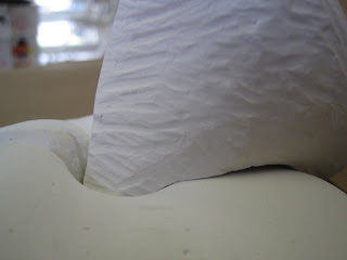
The negative space in my piece is under the bottom piece of plaster, where I carved out so that there would be less of the plaster touching the base, making the sculpture more interesting. There is also negative space inside the hole in the bottom piece of plaster, and underneath the top piece, where the two pieces meet. I think the best part of my sculpture is the sharp, zig-zag lines that I made with a clay tool.
-Julie
Monday, October 24, 2011
Collision
My project's main focus is on the two pieces of plaster that I transformed to make a finished sculpture together. They collide in the center of the bigger piece, in the process of colliding the illusion is to seem as if the collision made cracks. Along with the cracks there are intricate details to make my sculpture unique and bold. In the process of creating this sculpture I think the details was the most entertaining and came out the best.
-Brandy
Holy Coral
For my plaster sculpture I used Coral as my theme. I love the shape, and the texture, and I incorporated that into my sculpture. Its very organic, it flows, and its rounded in shape. I believe the best part of my sculpture is the second larger piece, with the millions of holes. It was very tedious but I love how it came out. There is also variation in each pieces surface texture, which is also interesting to look at. If you look hard enough the smoother looking piece, has larger holes on the ends of what look like coral tubes. Finally, the smallest piece, has lines to represent tubes, and small holes. This was a lot of fun, and I would definitely do it again.
Felicia
Felicia
Left Behind
The negative space comes in where the smaller pieces where cut from the bigger pieces and moved back to symbolize something that has been left behind from the main piece. The best part is how you can tell the smaller pieces were once part of the larger piece, making it more clear how the smaller pieces where left behind.
-Josh
Sunday, October 23, 2011
POSTING THE COMPLETED PLASTER PIECE
Post photos showing all of the piece and one or two detail shots. Please discuss these topics with complete sentences...
1. What was the theme/concept of your piece?
2. How and where have you created negative space in the sculpture?
3. What is the best part of your work?
4. What is the name of your sculpture? Consider how the name will help your audience to interpret the piece....
1. What was the theme/concept of your piece?
2. How and where have you created negative space in the sculpture?
3. What is the best part of your work?
4. What is the name of your sculpture? Consider how the name will help your audience to interpret the piece....
Friday, October 21, 2011
Thursday, October 20, 2011
Shinigami
My theme for this was death and destruction. One piece says burn and the other shatter which have to do with that. The best part is the burning skull. This moves your eye around the piece with the writing wrapping around.
-Ann
Plaster Disaster
There is negative space contained in all of the holes and cracks. And the best part is the still but active design. -Peter
Tuesday, October 18, 2011
In my plaster sculpture, one piece of plaster is going through a hole I carved in the center of the other piece. The negative space in my sculpture is underneath the top piece, and inside the bottom piece of plaster, My favorite part of my sculpture so far is the lines I carved in the bottom piece of plaster that seem to be flowing outward.
-Julie
Felicia's in progress work
My plaster sculpture is of something you find in the water. (not telling you though). The negative space is in the center and there's a smaller piece inside. I was thinking that the two bigger pieces are almost acting protective over the smaller one. I think the best part of it is the shape. I love the roundness and and how its very flowy.
Felicia
Plaster In Progress
The negative space is in the middle of the two chunks and all through the designs. The best part, so far, is the flaming skull.
-Ann
Sculpture in Progress 10/18/10
The negative space is contained in the cracks in the land, the space between the mountain and the ground, and of course all of the holes that look like possibly crop circles or craters on the ground and caves in the sides of the mountain. As well as at the top of the mountain where it looks like it's a volcano. I think the best parts are the little buildings and the faults in the land because it appears to be an obvious disaster area. -Peter
Subscribe to:
Comments (Atom)


